Arabic Calligraphy and Type Design
This article presents the Diwani style of Arabic which lead to designing Thuraya, a contemporary yet faithful interpretation of the Diwani style with extensive calligraphic features.
Arabic calligraphy is undoubtedly one of the highest achievements of Islamic art, and over the centuries an enormous number of calligraphic styles have emerged from different regions of the Islamic and Arab world. Arabic writing is an ethereal art set apart by its diversity of styles, the skill and passion required, and the message it was meant to carry.
The powerful influence of calligraphy long inhibited the progress of Arabic type design development. Religious and cultural attachments to the art played a role in this, as well as the complexity of styles, which far exceeded the capabilities of Latin-oriented typesetting systems. Consequently, Arabic type made several disjointed jumps into the digital age, all marked by severe limitations: in the case of hot metal type, faithful reproduction of the calligraphic styles necessitated the creation of an extremely large character set (a minimum of 900 characters, Bulaq Press, Cairo, Early 1800s). In the case of Linotype’s simplified Arabic, the limitations of the typesetting technology necessitated modifications to the core of the script itself. Recent technological developments have removed many of these limitations, and several new possibilities are emerging thanks to growing interest in Arabic type (as separate from Arabic calligraphy) and to resources available to skilled designers.
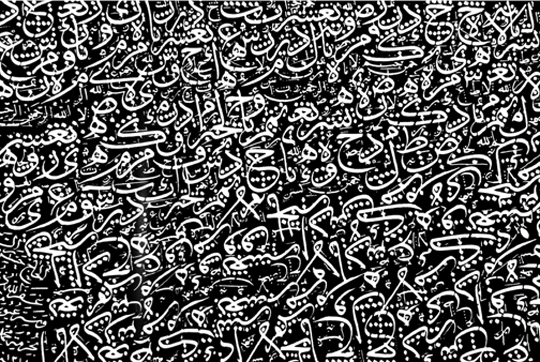
My fascination with Arabic calligraphy has always been my primary motivation for designing type, and since modern type design (not only for the Arabic script) has taken on a whole new level of complexity, I wanted to explore the relationship between these two areas.
My research focused on the intersection of calligraphy and type in a digital type environment, balancing the possibilities of both sides. For this purpose I chose the Diwani style, one whose complexity and unconventional rules have perhaps discouraged more extensive digital exploration.
The Diwani Style
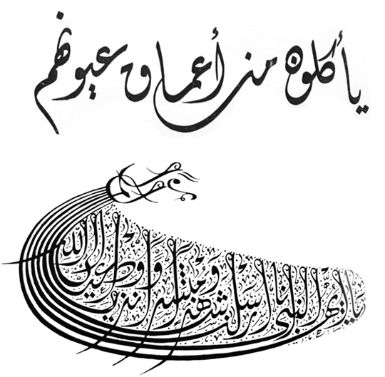
The Ottoman dynasty held the Arabic script and its calligraphic traditions in high and sacred esteem. They assimilated them, developing them with both devotion and great imagination, mastering the already existing styles as well as developing new styles of their own. The Ottoman sultans patronised the most talented artists of the day, which led to the rise of a very large number of skilled calligraphers. One of the most important derivative styles of this period was the Diwani script, which was developed in the late fifteenth century by Ibrahim Munif, and later modified and refined by the celebrated Turkish calligrapher Shaykh Hamdullah. It is a cursive script based on the Ta‘liq style, ‘written on a less dramatically hanging baseline, though its letter connections are vertical and slanted’ ¹. It is characterised by dramatically curved undotted letters which are joined together in an unconventional fashion, and by ending swashes that often extend below the baseline of letters. Diwani is written without vocalisation marks. It was practiced primarily in the council chambers (Arabic: diwan) where it was used for all of the official correspondence of the Sultans. The Jali Diwani, an ornamental variant which is highly admired to this day, is characterised by large geometric shapes created by the small, delicate ornaments which fill all the gaps between the letters and words. It was used for long names and the titles of the Sultans.
Studying the Diwani Style
Because I respect and admire the art of writing, its calligraphic practices and styles, and because the attempt to capture a calligraphic spirit in a digital medium inevitably involves the risk of losing the beauty and sacredness of the script, I wanted to make every effort to study the Diwani style before drawing a single letter.
Therefore I contacted the renowned Lebanese calligrapher Ali Assi and had several lessons with him in which we tried to cover all the information essential for the start of my project. My aim was not to be able to write Diwani, but rather to understand it, always keeping in mind the forthcoming change of medium and how this new knowledge could be applied in a digital type environment.
Under Mr. Assi I learned about the rules of Diwani, the structure and proportions of the letters (measured by the rhombic dot) in their different positions and alternative shapes, the angle and movement of the pen, the connections, the ligatures, and the unique, unconventional features of the script. This culminated in the detailed analysis that was crucial to an authentic interpretation of the script as a typeface.
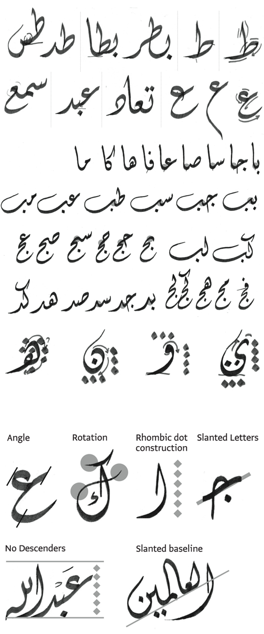
The angle of the pen is 60°, creating thin stems (verticals) and thick baselines (horizontals). Because of the angle of the pen and the excessively curled endings of the letters, the thinnest strokes involve a lot of rotation and usage of the pen tip.
The stem height is 6 rhombic dots, a relatively normal height, which maintains the horizontally compact texture of the style.
The connected letterforms all have slanted horizontals, and the general vertical axis of all the letters is inclined to the left.
A distinctive feature of Diwani is the no-descenders rule (except for the letter meem), contrary to other scripts where the letters are drawn between a maximum descenders line and a stem height line, with a baseline, several loop height lines and several descenders lines in between. This contributes even more to the general compact feeling of the script.
The most complex and distinctive characteristic of the script is the slanted baseline. This feature is responsible for the most unconventional connections and shapes.
Levels
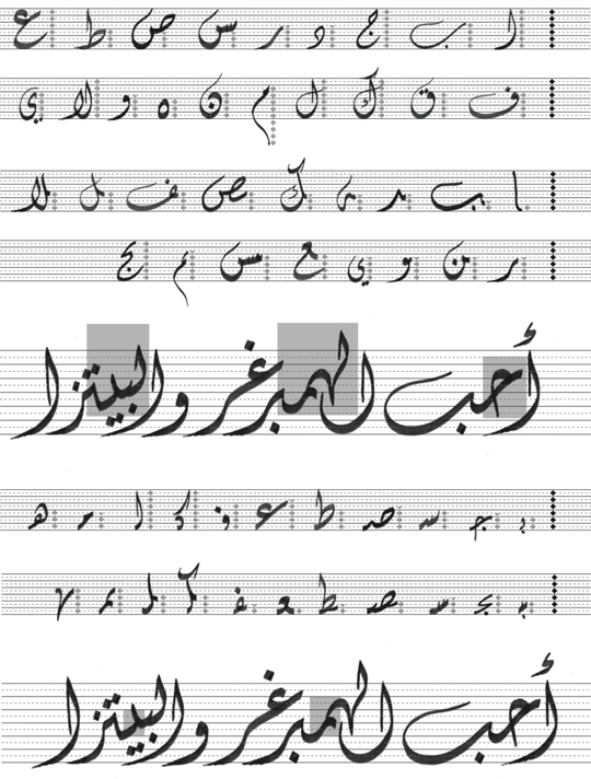
My approach to analysing the structure of the script (and beginning to understand the limitations imposed on the calligraphic features by the digital medium) was to divide the stem height into six levels (according to the number of rhombic dots) and six sub-levels. Each letter occupies a specified number of levels, and in the case of the isolated form of a given letter, this number affects only the letter itself. In the case of the terminal form of the letter, however, this number affects the height of the letter’s connection with the entire preceding combination. Similarly, in the case of the initial form of a letter, the number of levels occupied affects only the letter itself, but in the case of the medial form of a letter, it affects the position of the preceding letter.

The last letter in any combination has to sit on the baseline, so the position of the initial letter is determined by the connection level of the terminal letter, the number of letters in the combination and the number of levels each letter occupies.
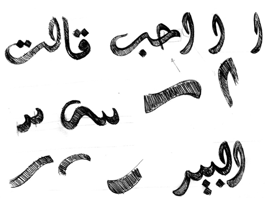
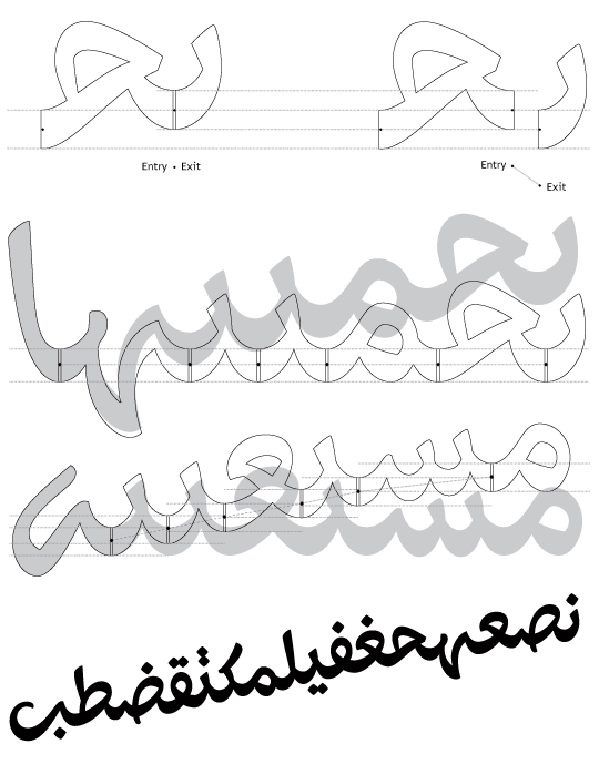
The design process that led from Thuraya’s first sketches to the final digital version was full of ups and downs. Assuming that the slant would eventually work, I started two sets of quick sketches, one based strictly on calligraphy and one separate from it (without losing sight of the structure). After several rounds of drawing and much time devoted to designing slanted letters based on the calligraphic style, I came to an important realisation: forcing the typeface to follow the rules and proportions of the calligraphic script was not the right approach. Like every other feature of the script, this system had to be adapted to the capabilities of the digital typeface. I had been so fully focused on designing the glyphs according to the levels of the letters that I had not explored the shapes of the letterforms independently of the number of levels they occupied. The result was an outdated feel and unsatisfactory shapes. Thus a major decision had to be made: I would put aside the slanted baseline in favour of preserving the Diwani shapes and achieving smooth connections between the slanted letters, diverging from calligraphy while preserving its spirit.
From this straight-baseline typeface I would later devise a new system to incorporate the slant feature. There would be two versions of the typeface, each suited to a different purpose.
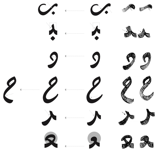
Drastic changes included minimising the inverted curves, creating clear cuts following the pen movement, making the teeth more pronounced, reducing the curled endings of some letters, changing the shapes of some letters to avoid confusion while reading, and opening all the closed counters.
On the other hand, keeping the clear horizontal slant and smooth curved connections of the letters, and playing with the levels of the isolated glyphs were ways to create a dynamic liveliness in the typeface. I was very pleased with the results. The effect was instantaneous. It looked like a nice start, and from here on the letters went through several cycles of changing and fixing and redrawing to meet the needs of the typeface.

Levels As a Typographic System
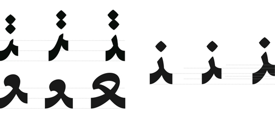
Having gotten the design process of Thuraya Regular on the right track, I returned once again to the idea of Thuraya Slanted. This time, however, the slant and level system was based not on the original calligraphic principles, but on a simpler concept derived from the straight-baseline version. To achieve a fluid, aesthetically pleasing result, every letter’s slant (i.e., the number of levels it occupies) would be proportional to its width. At this point the entire design was still largely theoretical with no real evidence that it would actually work. In spite of this fact, I continued to develop both versions in hopes that they would both be successful.

Thuraya Slanted Born
After a 3-day-workshop with Adobe’s Miguel Sousa, in a discussion with Erik van Blokland, Miguel suggested the cursive feature as a possible solution for the slanted baseline. The feature works as follows: Named anchors are placed at the connecting points of each glyph (‘exit’ anchors for the initial glyphs, ‘entry’ and ‘exit’ for the medial ones, and ‘entry’ for the terminals) and the cursive feature connects the ‘exit’ to the ‘entry’ anchors.
Curved Baseline
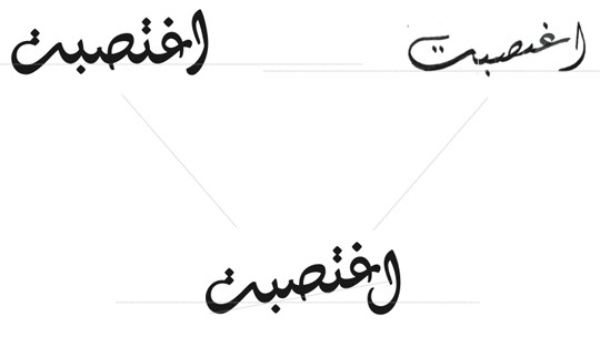
One of the main characteristics I wanted Thuraya to have was a completely curved baseline with high, tight curves. Creating one smooth curve out of two separate connecting curves requires coordinating the width and radius of the downstroke with those of the upstroke. Since both depend on the structures of the letters themselves, the key is to find a balance between all the possible downstrokes and upstrokes, shifting the optical connecting point slightly to the right, since the typeface has a vertical slant to the left. Dealing with the connections of the slanted version followed the same principle as the straight version, with the additional dimensions of the width and radius of the downstrokes and upstrokes adjusted for the slanted baseline.
Ligatures
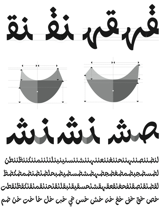
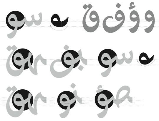
To keep a harmonious calligraphic flow and a rhythmically curved baseline, several letter combinations were designed as ligatures. This is because of some letters like reh, zayn, yeh, alef maksura and alef maksura hamza, which don’t connect on the baseline, and other letters like waw, waw hamza, feh and qaf which were difficult to connect smoothly while preserving the slanted vertical axis. The 660 ligatures (included in both styles) include every combination of the terminal forms of waw, waw hamza, feh, veh, qaf, yeh, alef maksura, alef maksura hamza, reh, zayn and jeh, with the initial and medial forms of all the other letters.
Other ligatures were designed either to achieve a smoother connection, as in the case of feh-alef or qaf-alef, or to solve the problem of overlapping diacritic dots, as in the case of yeh-yeh.
Titling Alternates
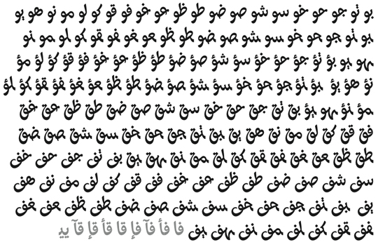
Some letters connect vertically. This is an important calligraphic feature which I also decided to implement in Thuraya. Therefore a set of alternates mainly intended for titles was designed for an even more authentic calligraphic expression.
Thuraya explores the intersection of the historic Diwani calligraphic style and a digital typeface. With its 2 styles, it is a contemporary yet faithful interpretation of the Diwani style with extensive calligraphic features.
Author: Kristyan Sarkis | www.kristyansarkis.com
Originally published by Typotheque