Arabic Typesetting Revisited
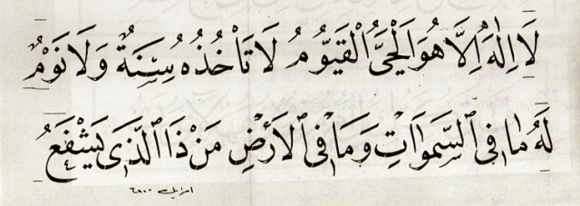
Hand written naskh (by Ibrahim Khattat – Iraq 20th century)
My involvement with arabic has always been, for over 40 years, essentially calligraphic and I have always disliked the idea of trying to mechanise an essentially hand written script. But the practical demands of publishing in the modern world has meant making a kind of a rapprochement which has meant accepting its use. But it comes at a cost.
When Egypt became the media centre of the Muslim world after the fall of the Ottoman Empire in the 1920s it established modes in the typesetting of books, manuals, newspapers etc., which flooded the Arabic speaking world and beyond. The script of choice to accomplish this was naskh which was the prominent style for text amongst arabic calligraphers everywhere. At that time printing was universally letterpress moveable type with words (and spaces), hand composed from minute blocks of metal, which was a very time consuming process but necessary for printing to be possible. The history of arabic typesetting is quite interesting as the first attempts were actually made in Italy as long ago as the 17th century, and not in the arabic speaking world. You can read an in-depth article on this by Paul Lunde in an Aramco World article from 1981. (see link below) You see in his study the political and religious import of printing and its part in the fall of the Ottomans and the rise of the west. Also how printed arabic made available treatises on science to the west which were lost when great libraries of places like Baghdad and Cordoba, with its millions of handwritten texts, were destroyed by the Mongols and the Spanish Catholics.
There were calligraphic variations in naskh even though the great Ottoman khatats of the time had resolved the handwritten script into an almost typographic uniformity, but beautiful as well. It is known that in the time of the Ottomans, a whole book could be handwritten by a group of calligraphers dividing it into sections but with indistinguishable styles of writing in naskh script. In Ottoman days I am told you could get a book expertly copied by a team of calligraphers like a giant human photocopying machine and have it bound and illuminated for a bit extra. So it was logical to develop thenaskh style into a typeface. I may have mentioned in earlier posts about the Daily Jang, an Urdu daily newspaper produced in a London. In the 1980s I was working for an advertising agency and our main banking client required a newspaper ad in Urdu. I found a calligrapher to do it who had just lost his job as a calligrapher producing along with many, possibly a hundred other calligraphers, the whole Daily Jang, Pakistan’s major daily newspaper produced in London, traditionally by hand. The newspaper had installed computer typesetting and laid most of them off.
In the world of Roman type there are literally tens of thousands of typefaces. These styles reflect a whole history of western lettering styles going back over 500 years. The varieties of Arabic scripts are minute by comparison and this is reflected in the relatively few arabic typefaces available even with the proliferation of computer use. Some say this was because of rampant piracy but also because there was no escaping the fact that anything but the traditional styles were unutterably ugly.
Despite this vast cornucopia of type possibilities I have reduced my own choice of both Arabic and Roman faces these days to about three or four for various reasons. Beauty, legibility, printability etc all come into play because this all adds up to what is easy to read and communicate the author’s message accurately and with least effort. Good typesetting is often described as being invisible i.e. that it doesn’t get in the way.
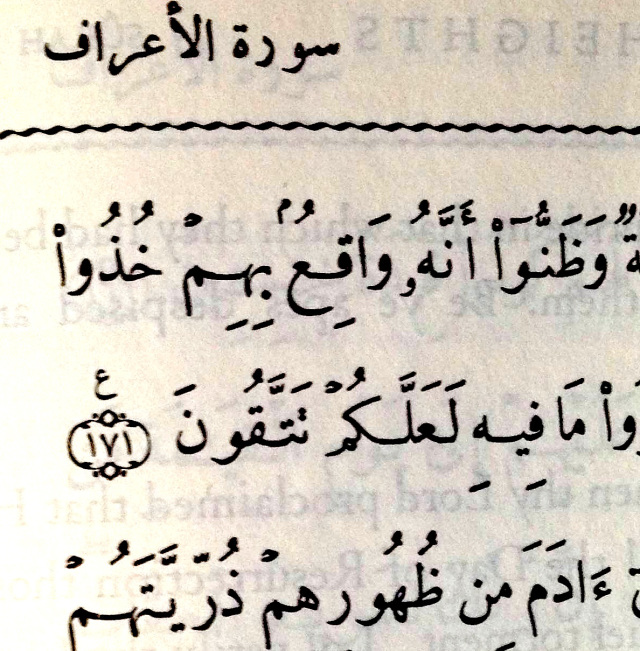
Pickthall’s 1930 Hyderabad Edition hand set in metal moveable type.
Arabic typesetting has a complex history, as a cursive script with many links and variations that occur in Arabic, requires many more elements to be combined together than Roman text. With hand composed metal type this is very complicated and resulted in as many as a hundred and fifty separate elements once you start to include all the various Arabic ligatures, connections and vowels. So the early Arabic typefaces were simple iterations of naskh and actually very good although not able to deal with the flexibility that hand calligraphy allowed. The Hyderabad Pickthall translation of Quran first published in 1930 (see above) used a hand composed metal naskh typeface which was for for many years a workable Arabic print face and was not improved upon until the coming of firstly hot metal composers, then photo-setting and later computer setting in the 1980s. It has now reached incredible levels of sophistication albeit still limited by the fact that it had to be input from a keyboard.
All this compelled IBM in the 1950s to try and create, with the help of Nasri Khattar a well established calligrapher and designer, an Arabic face based on discrete glyphs (ie not joined up) so that it would fit their 256 ASCII character set based upon the qwerty keyboard. This experiment mercifully failed as it would have violated so much of the script and what was well established over the vast expanse of time, since the first complete Qur’an texts which had been written down in pen and ink on vellum. This would have been an aberration too far.
The few Arabic faces I use when there is no possibility of hand calligraphy, are stylistically limited but suffice. One of them, Decotype naskh was an attempt to mimic the way a calligrapher writes although some find it a little difficult to read. Thomas Milo, a Dutchman, who was once a gun-toting United Nations worker in the Lebanon, who created this, originally intended it to be used with its own software engine and was very effective but it got dumbed down somewhat when it appeared as a standard font on Mac and PC platforms in the 1990s as it had to bypass its natural variations from the base line. In other words it became more or less a linear script which naskh is not. (see the illustration at the top) Milo’s Tasmeem plug-in for Indesign mitigated some of these shortcomings, but who has the time to fiddle with text in this way? If you want calligraphy get a calligrapher. Another face I use is Linotype Lotus which began on PCs over thirty years ago and which is one of the best non-calligraphic faces but lacks certain important characters if you set Qur’anic text. A few more pass muster like Karim LT but as for the rest they are mostly abominations reflecting Arab designers’ modernistic tastes. One compromise I have made which works, is to mix hand calligraphed Arabic for titles with typeset blocks of text. Many Arabic newspapers and magazines used to do this.
My rapprochement with typeset Arabic is not unconnected with my view of the early Arabic scripts which were unselfconsciously the vessels of knowledge, its translation and dissemination, and not made for artistic merit although with implicit and unself-conscious beauty. These days if all Arabic writing was by hand the dissemination of knowledge would be severely impaired. But this does not diminish my gut feeling that typeset Arabic is not a substitute for writing by hand and all its many secrets.
In the madrassas of India, I am told that the teachers still prefer to teach from hand written lithographs rather than printed texts. There is an understanding of the deep connection of handwritten letters, learning and religious knowledge and the recent understanding that the human brain responds profoundly to hand written right left writing. God taught by the pen, not by the computer.
Visit www.ianwhiteman.com for more information.